
Design is not what it looks like and feels like- Design is how it works.
When it comes to Websites, usability and quality speak louder than just a pretty page. Websites are the extra platforms for your business to expands its service reach. Websites are not amusement parks, they are the pillars that hold strong your business. Let me explain it clearly, Websites are the visual presentation of your business public face that represents your distributing services and solutions. Statistics have shown that 6 out of 10 customers expect brands to have online content.
What is a Website design means?
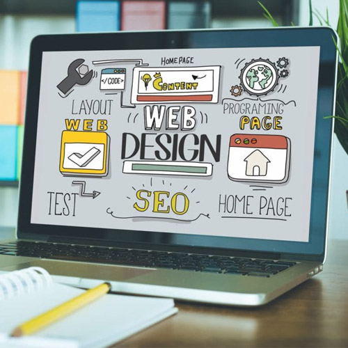
Website designs are referred to as, user experience aspects of website development. A good website design is easy to use, gives an aesthetic essence, and adds up a unique value to the business. The website layouts, fonts, and content any designing aspects of the site must not confuse the users. So creating a unique function-rich website is a key to win over customers and foster trust in the service of the business.


Benefits of having a good Website design?
An effective good website design sets the first impression on your visitors that benefits SEO campaigns to builds trust which converts visitors into customers and makes the company name stand out as unique among the competitors that creates brand consistency. When the website is pulling in more traffic, able to make the customers trust the service; the website will drive great revenue.

Do you know, why website design is important?
It only takes 0.5 seconds for the user to judge the business by its website. So the below facts will give an idea of how important is to have a good website design that is flexible, easily comprehensible, well-created layouts, peculiar content, and much more with unique features.
- Do you know, 94% of the people are attracted to services by its website design presentation.
- Do You know, 46% of customers decide the credibility of the brand by its web design.
- Do you know, 38% of the people leave the page because of its content & unattractive design theme.
- Do you know, 74% of people judge the brand by its online presence presentation.
- Do you know, 88% of users never step into your website, if they experience a bad impression out of your website.
Users perceive a company as a whole through a website. If you want to operate an effective business you should consider the importance of Website design.
So far we have seen the good things about websites, The desire for heaven will double if you know the taste of hell, in such a way if you know what is bad website design you don’t want your website to be like that one.
Let’s discuss Top 12 mistakes to avoid while designing a website in 2021
Mistake #1
Slow loading
Slow and steady wins the race but not wins website visitors. Faster the website loading, the better experience you’re providing your website user. Show your web page visitors you never waste their time on unloading slow pages. If you think your website is slow, consider the images and content quantity they might be slowing down the page
Mistake #2
Unresponsive
What works on the big screen is not working on the mobile you are providing an unresponsive website. The number of smartphone users around the globe is increasing more than the toothbrush, what do you expect people will see your website through mobile and tablets. Test your website is that mobile-friendly or not.
Mistake #3
Missing CTA
70% of Small business websites lack growth because they lack a proper call to action button, What, the customers supposed to do when you don’t direct them to ask your service. If you don’t they can’t.
Mistake #4
Disturbing Pop-ups
Websites with annoying pop-ups will get problems in ranking in the search engines. Nobody loves Pop up while scanning the website. At least, we can provide non-annoying pops up. The non-annoying pop-ups conversion rate is 3.09% in 2020. Think about that!
Mistake #5
Unclear Navigation menu
Website navigation issues can kill your website traffic faster. Hiding the navigation menu from the user is one of the common mistakes in designing. Ensure the navigation of your website is flexible and understandable, even so, clear to strike the users’ eye.
Mistake #6
Typographical errors
Website visitors expect clear and understandable content fluency throughout the site page. Select the proper font, font size, and spacing that clearly explain what you’re trying to convince your audience.
Mistake #7
Lack of Security
If your Website is not secure, it doesn’t make sense in inviting customers into it. The unsecured site puts users’ private information at risk. Visitors won’t believe you unless your site is safe and secure. Update your site with an SSL certificate. Especially no one wants the website that warns the visitors it’s not secure.
Mistake #8
Irrelevant content
The content conveys to the visitors what you’re up to and how you assist them with your business and services. Relevant content can increase the credibility of your business. So offering relevant content is an important factor to consider while designing the website.
Mistake #9
Forgetting Website Tab icon(Favicon)
The website tab icon offers a visual reference while surfing through the websites. Usability of the website function stamps the brand image in the customers’ minds.
Mistake# 10
Lack of contact info
This is one of the massive mistakes that need a spotlight to rectify. Remember that never give your visitors a bad experience like making them search around the website for contact details. Make your contact info one click away.
Mistake #11
Lack of optimization for Search Engine
Maybe your website is good in the design but not SEO optimized what is the use of that website then. Proper SEO optimization quicker Search engine indexing. Ensure your website is SEO-friendly by giving exact search text and content.
Mistake #12
Inappropriate Video/ Audio
Appropriate Video and Audio attract the attention of the user at the same time some people don’t prefer such things while browsing. So make sure your background videos and audios have a proper pause and play button.
Rapid points to create flawless website designs
- Make it responsive to all virtual devices
- Remove the broken links out of your website
- Select the readable and good font for your website
- Optimize the loading time
- Remove unnecessary images and content from the page
- Solve all the topographical issues
- Provide a quality relevant content
- Make the navigation menu flexible and easy-to-follow.
- Test it before you launch the website
- Ensure the website is secured
- Fix all generic 404- page issues.
Conclusion
Creating the best website is a significant fundamental factor to business success. A simple and function-rich can make your website design great and user-friendly.
Keep in mind your audience and the brand value you want to deliver in every process of the website design if you fix that your website will be a fragrance to your business all around the digital realm.
Contact us online at marketing@spiderindia.com or call us now at +91 9940179997, if you want to know more or want to ultimately save time and money on website development.

Well explained article. I got clear idea on how to design a website